In 2021, I was approached by a group of university students wanting to start a Science Communication project, specializing in Physics. Although they had plans of also organizing events, most of their communication would be done through Instagram. Their goal was to not only inform people but also show how fun and interesting Science actually is, so they soon realized a strong visual presence played a key part in captivating their audience and conveying these messages.
Logo and Branding
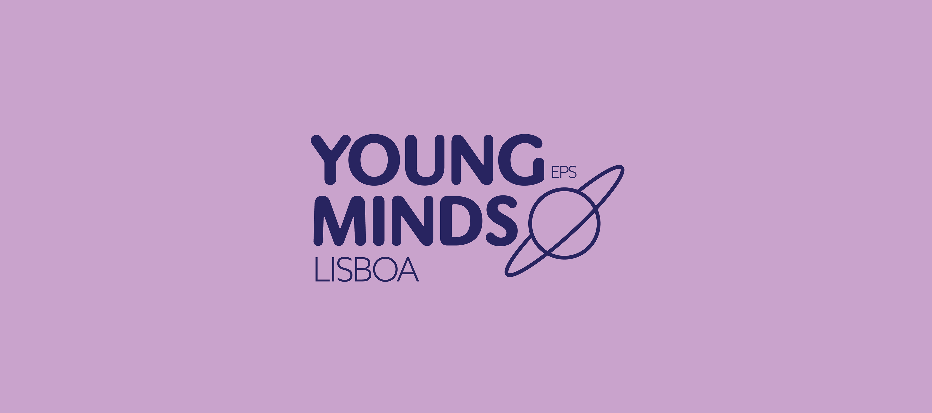
I opted for sans serif fonts, to maintain a modern look. The logo felt especially challenging because it had to include an organization the project was associated with, as well as the city the group was based in.
In order to balance out all these different elements, the logo is composed of two different fonts: a thicker, more rounded one for the name of the group, which I thought really captured the fun and relaxed stance of the project, and a simpler one for the other elements. The contrast between the two, aided by the sizing of the different elements, really helps with visual hierarchy, making it clear that the name of the project is Young Minds. I also added a simple illustration of a planet for balance, which can also function as a symbol/icon.
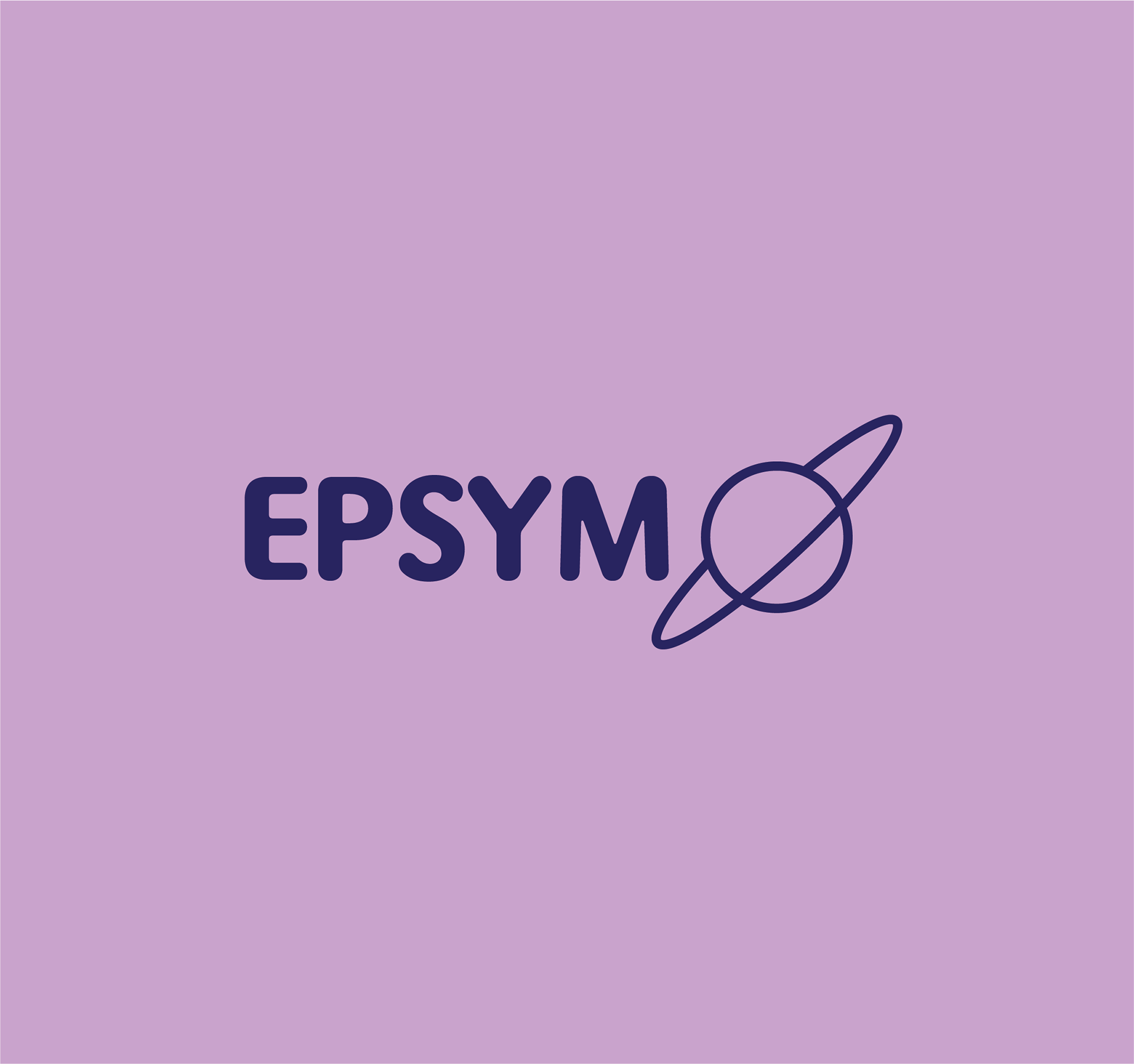
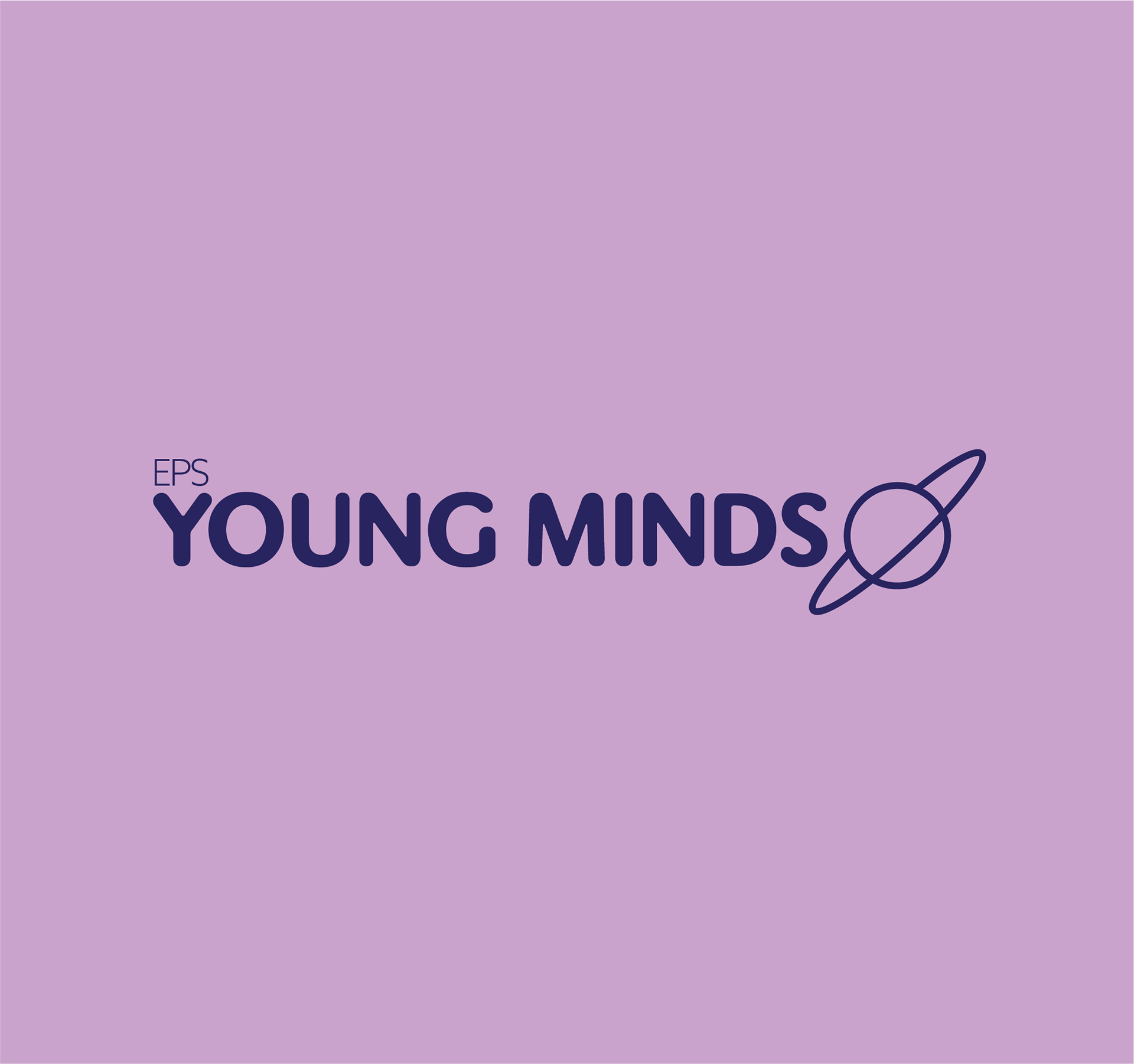
Finally, I created some different variations of the logo, so as to make the branding more adaptable to different mediums and situations.
I decided on mauve, for a friendly and upbeat look, and dark blue, symbolizing rationality and stability, as primary colors and purple and a very light blue as secondary colors.
A member of the group created some illustrations, which I cleaned up and vectorized so they could be used throughout the branding.
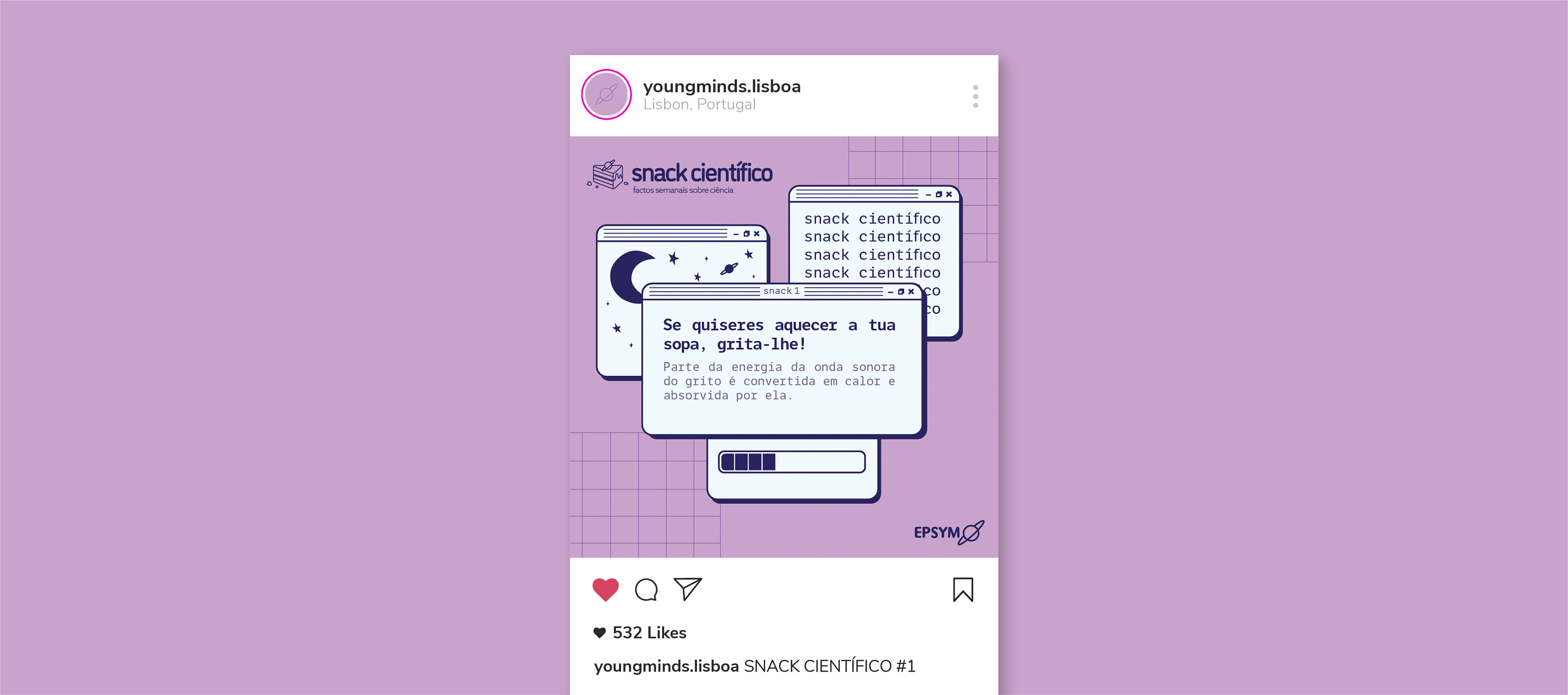
Instagram Posts
The group wanted to create a series on their Instagram called “Snack Científico” (Scientific Snack), where a small scientific fact would be shared per post.
Based on group member Inês Heitor’s sketches, I created a little logo and symbol for the series, with the same rounded font in the project logo, for consistency, and an illustration of a slice of cake which features the project symbol in place of the usual cherry on top.
For the Instagram post, I got inspired by retro computer aesthetics and created a layout based on different dialog boxes.
Even though I could not participate in the project any further, it was an incredible opportunity to work with other people and attempt to make their vision come true.