Looking for ways to practice my skills, I took on one of Abi Connick’s design challenges. The brief was a follows:
Dead Sour is a mouth-watering sour sweet business that has been voted the nº 1 extreme sour brand in the world! They offer a huge range of sweets with extreme sugar coatings!!
They have been using an outdated brand identity for 3 years that feels disconnected to their audience. Dead Sour are looking to launch a new range of sour sweets in the next few months and are in desperate need of a rebrand!
You can check the post here!
Logo and Branding
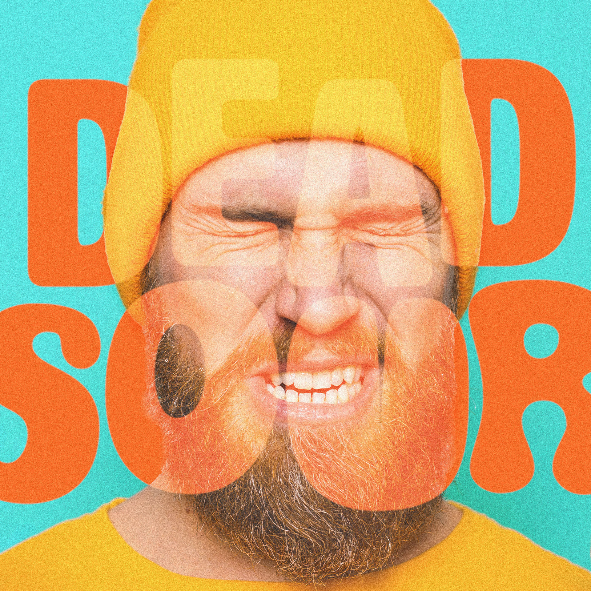
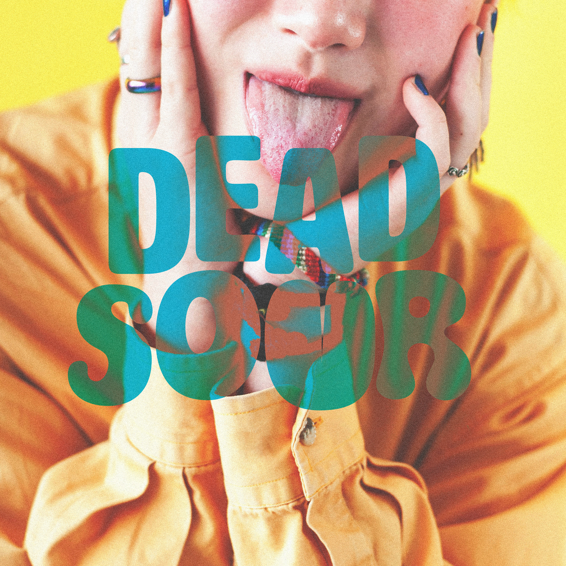
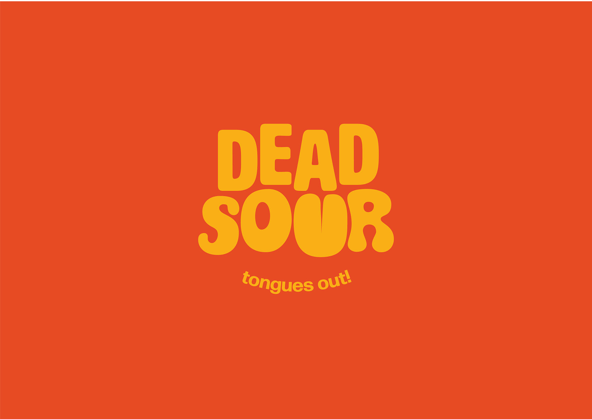
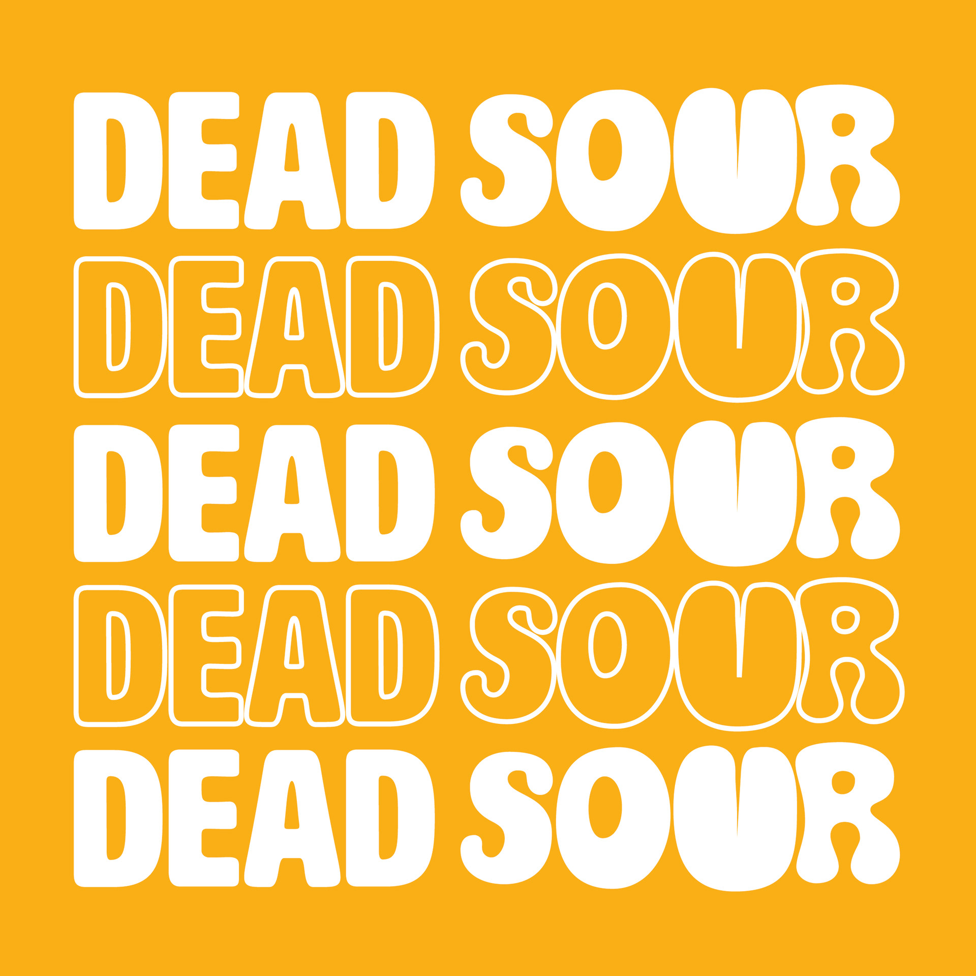
My font choice for the logo was slightly inspired by retro design. I knew I needed something bold and rounded. I began with the simpler one you see in the word “Dead”, but soon felt I needed to add a little more sourness to it, so I looked into other fonts. I found the spice I needed in the second font, which was even more rounded and looked almost gummy-like. However, the entire logo in this font felt a little too goofy, so I tried pairing them and I quite liked the result. I put the letters at different heights, which I felt gave the logo a bit more movement. Finally, I modified the “U” in “Sour” to look like a tongue, as a nod to the faces we sometimes make while eating sour food.
I opted for a stacked version for the main logo, but also made a horizontal one.
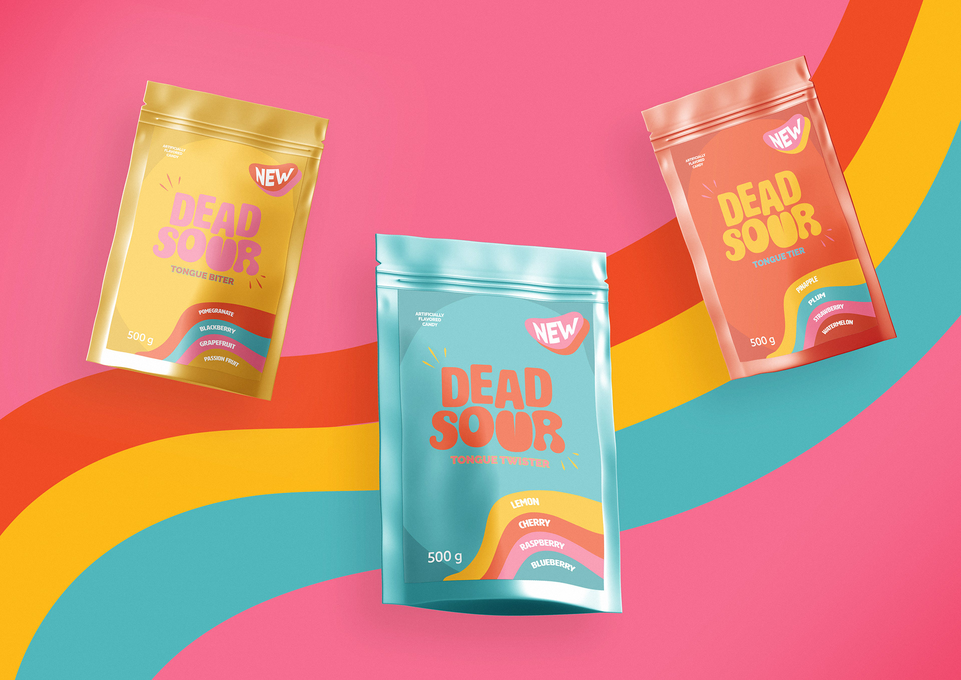
In the challenge brief, Abi also provided a moodboard, which really helped me find a color palette. The vibrant, almost artificial, group of colors felt like a no-brainer.
Applications
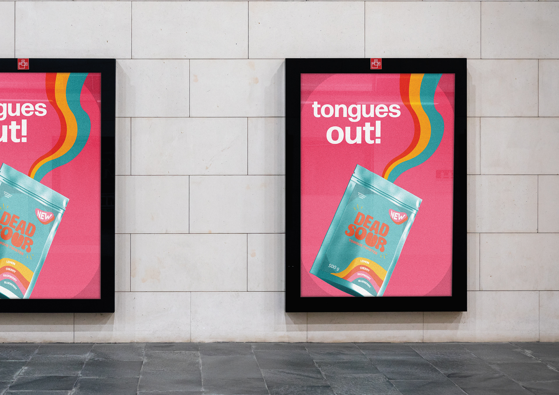
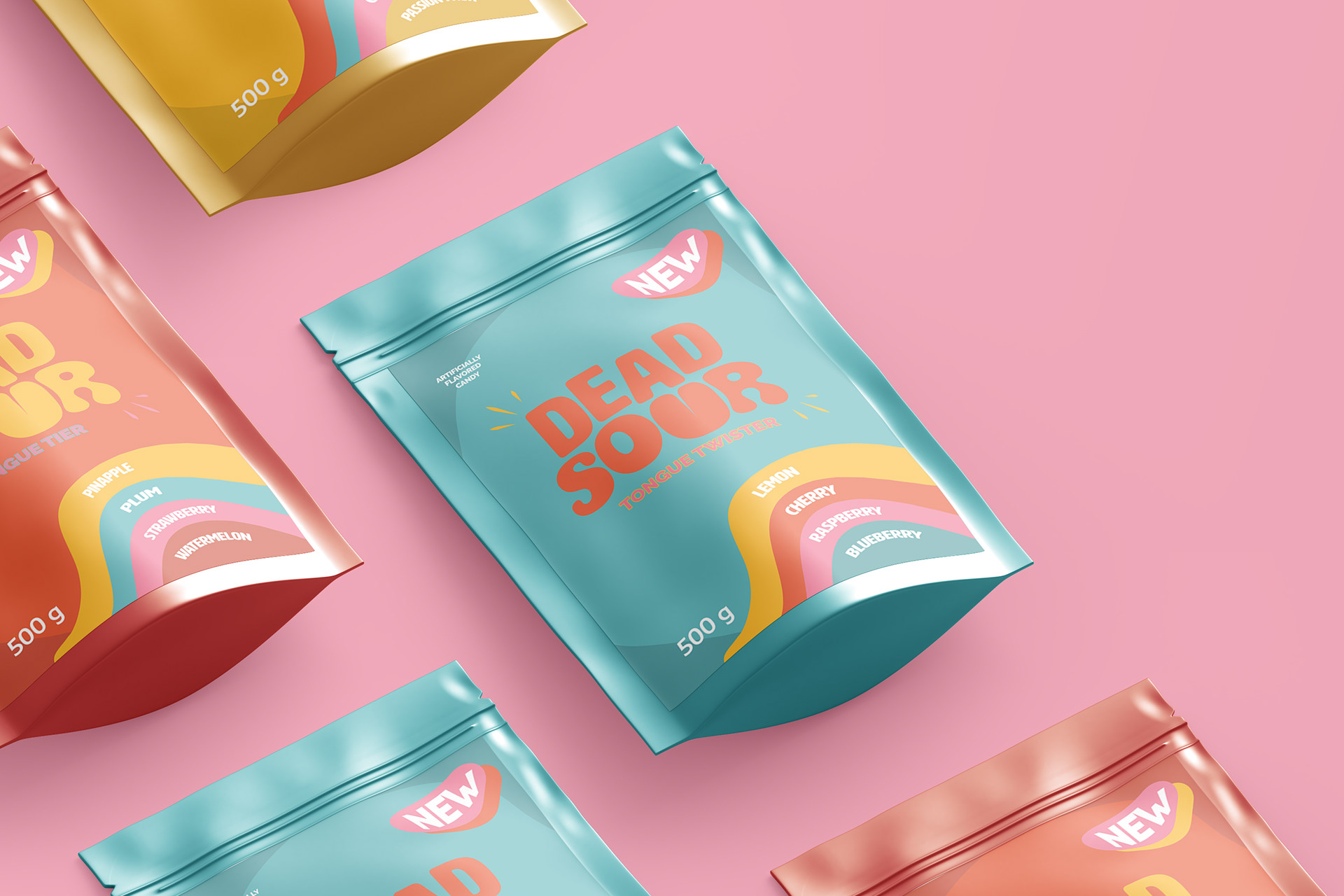
Part of the challenge was to create some packaging, so I designed three different packs of candy: Tongue Twister, Tongue Tier and Tongue Biter.
Mostly for fun (let’s admit it), I created a simple advertising campaign centered around the idea that sour candy usually makes people make funny faces and especially stick their tongues out.
With this in mind, I made up the slogan “tongues out!” and created a series of promotional images for both social media and physical advertising.