"CLAUDE" is a fictional soap brand, initially created for an Illustration exercise. The name evokes Claude Monet, a painter whose work often instills me with a sense of peace and calmness. Keeping those feelings in mind, I had a very interesting time trying to come up with a branding that was able to summon a similar experience.
Branding
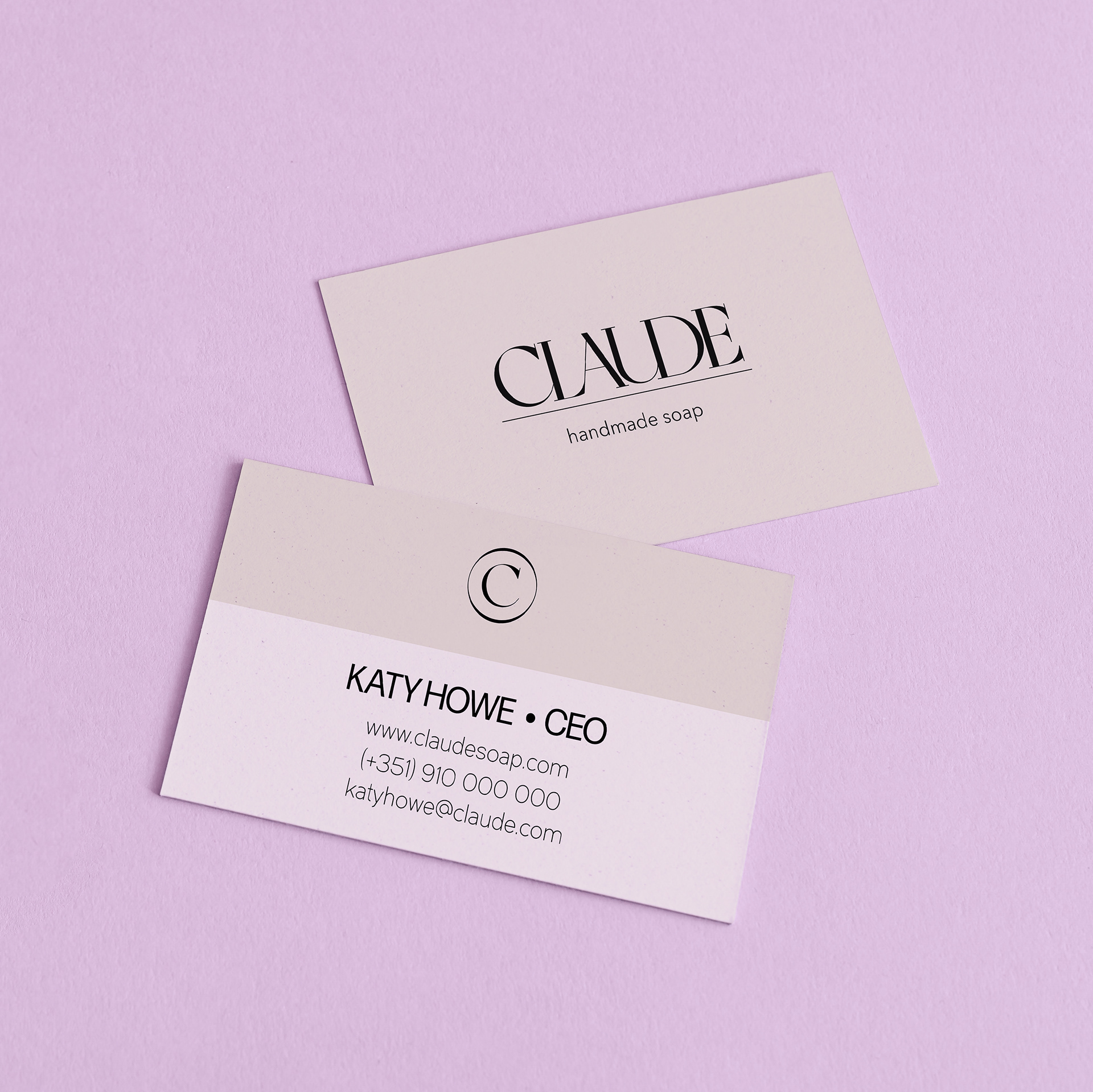
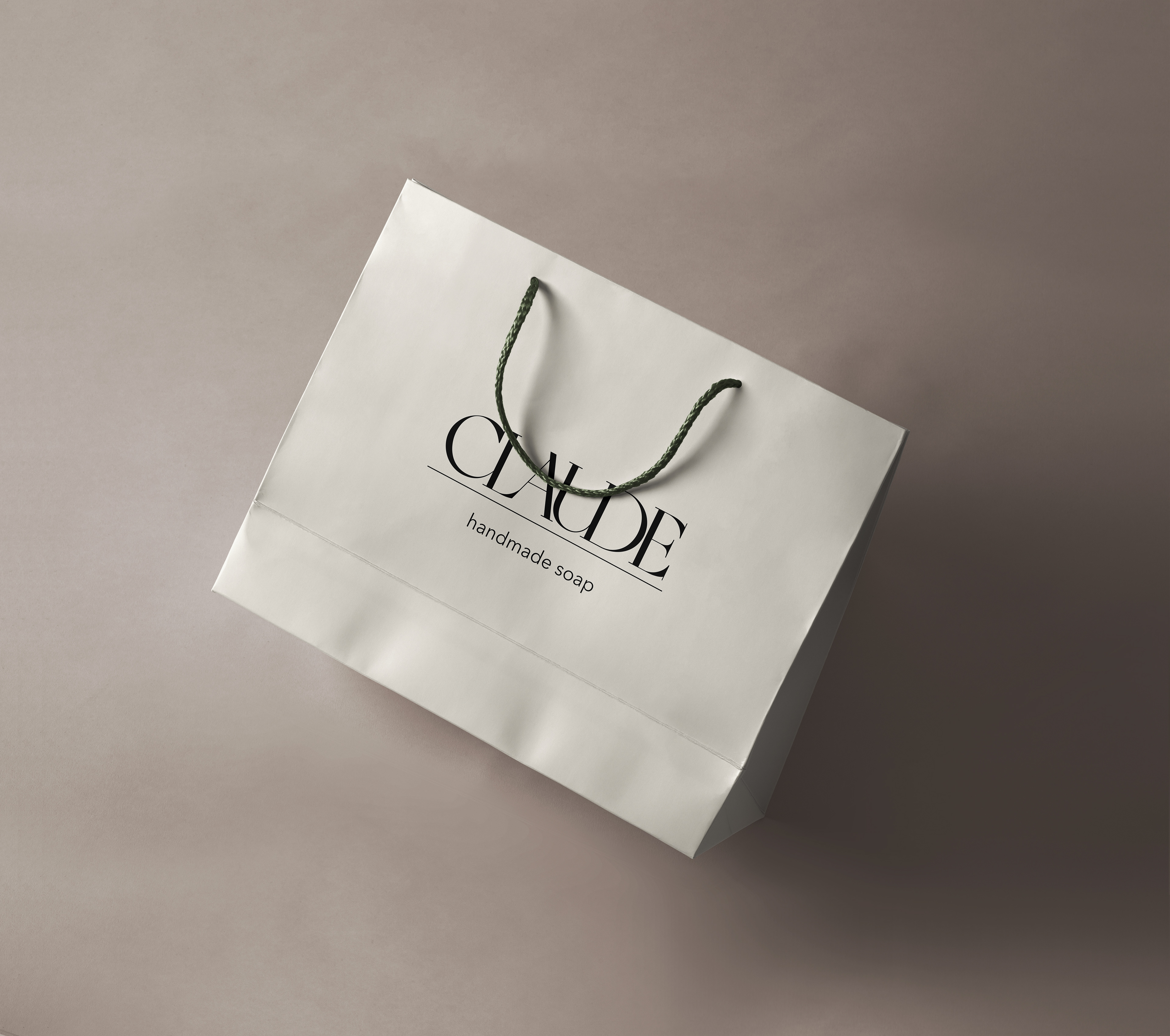
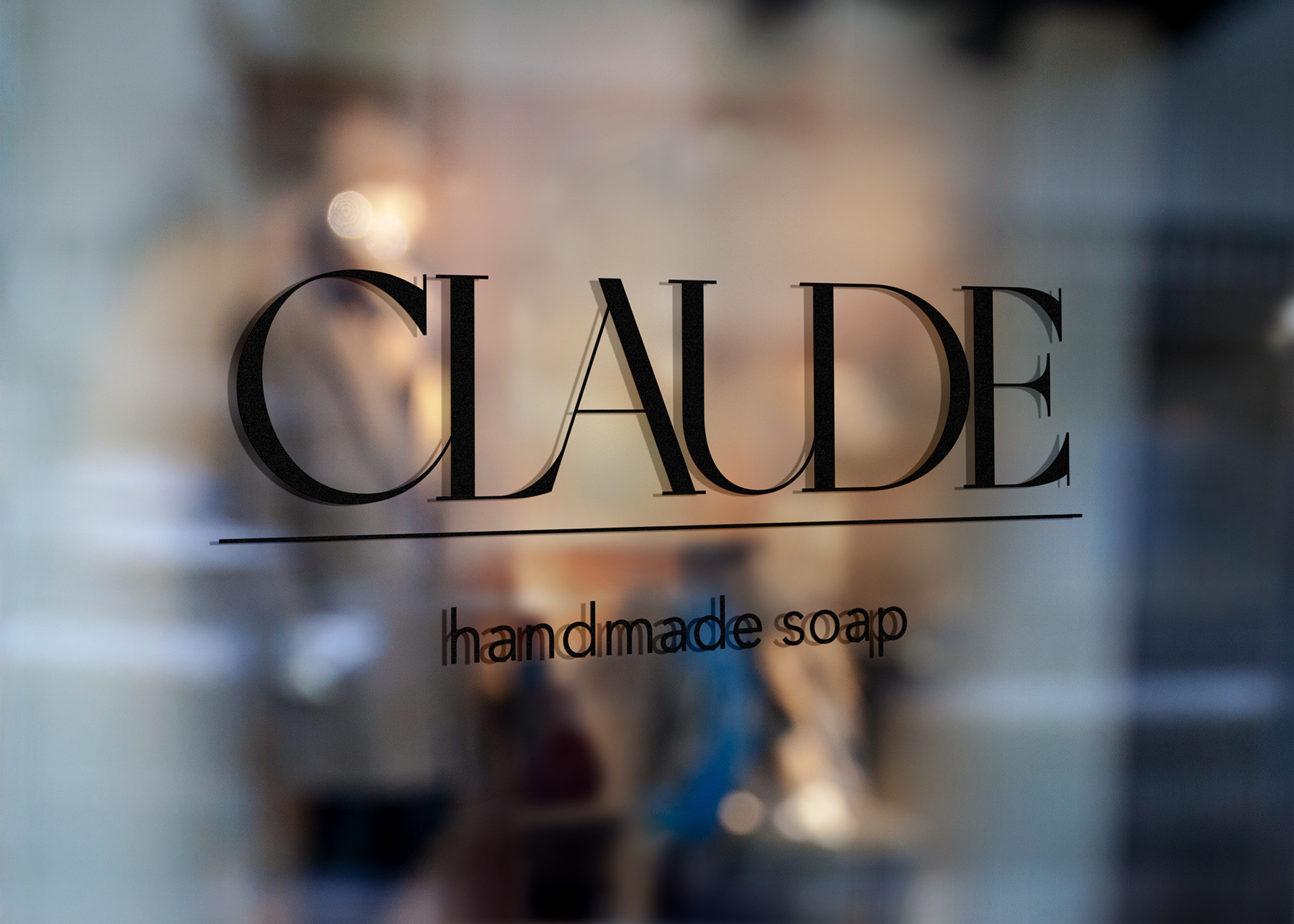
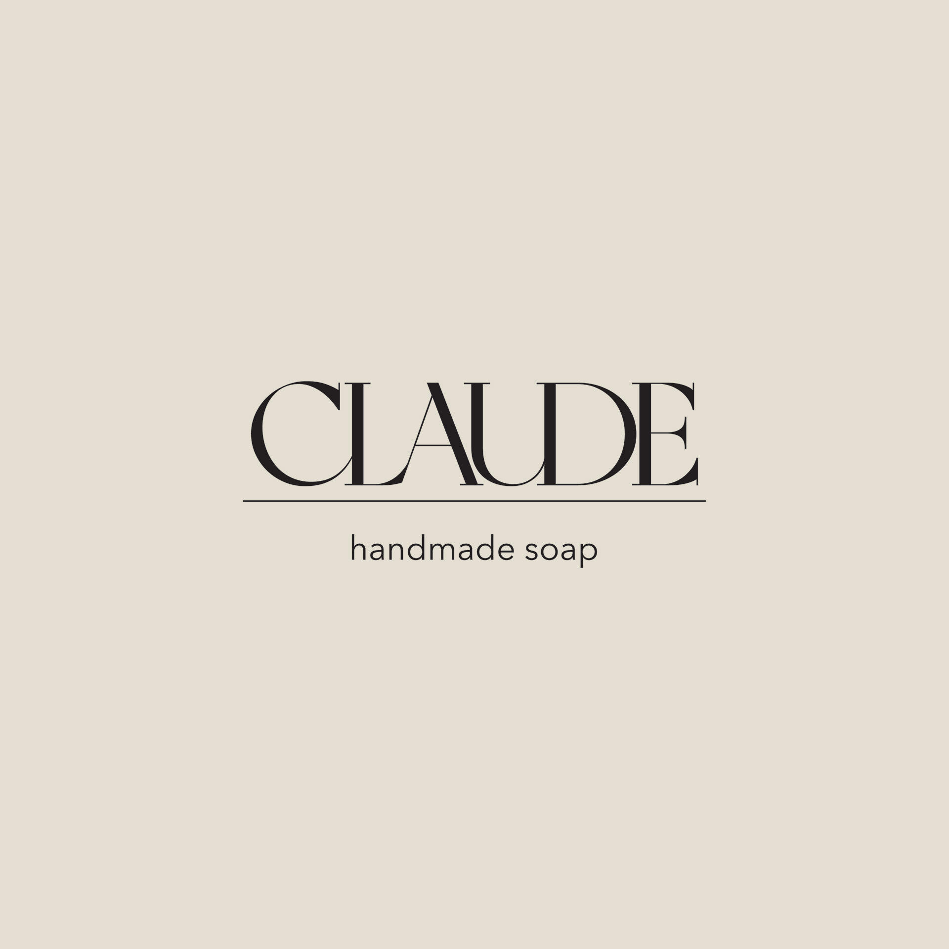
For the logo, I wanted an elegant and simple look, so I chose this beautiful serif font. I modified it slightly by merging some of the letters together, which made it flow a bit better.
I paired it with a simple sans serif font for the text “handmade soap”.
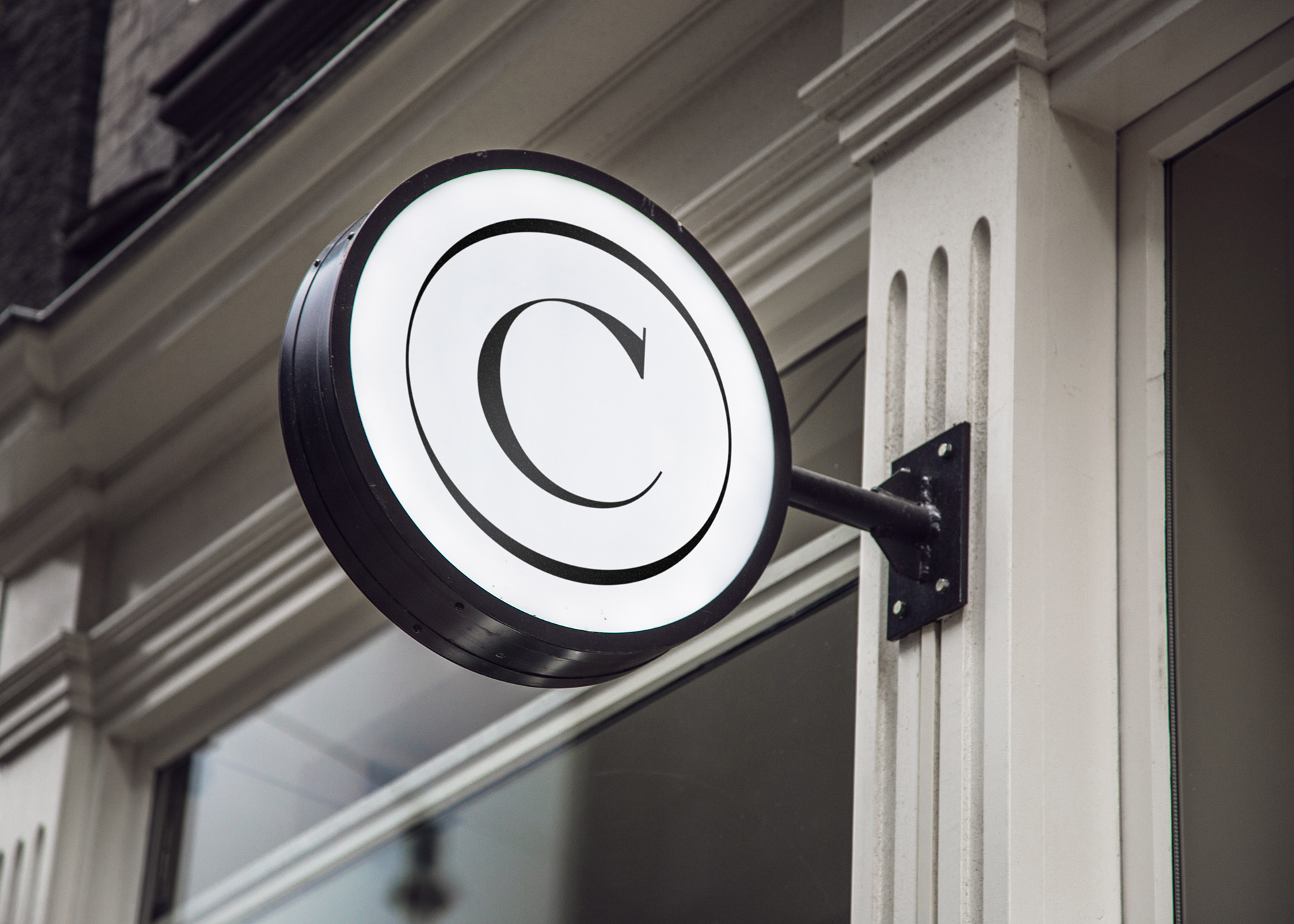
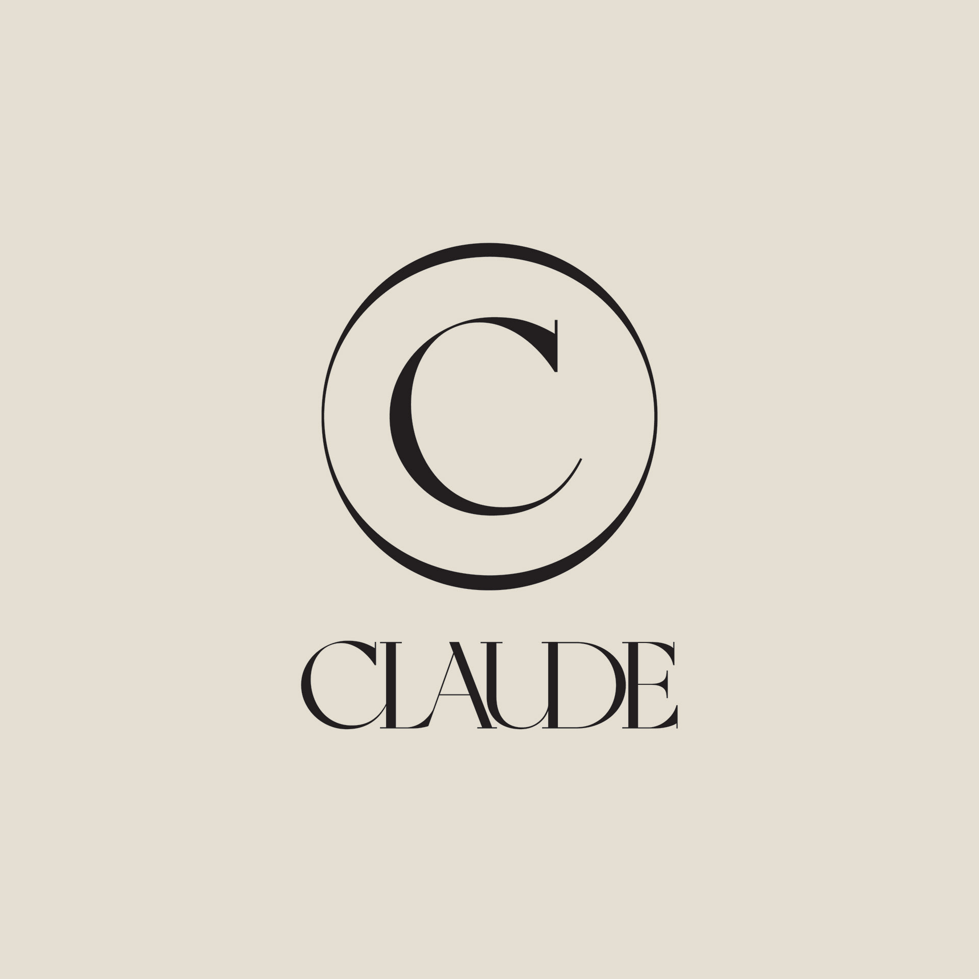
I also felt the C would work beautifully on a logo mark so I isolated it and created a circle around it, mimicking the thickness variation in the font.
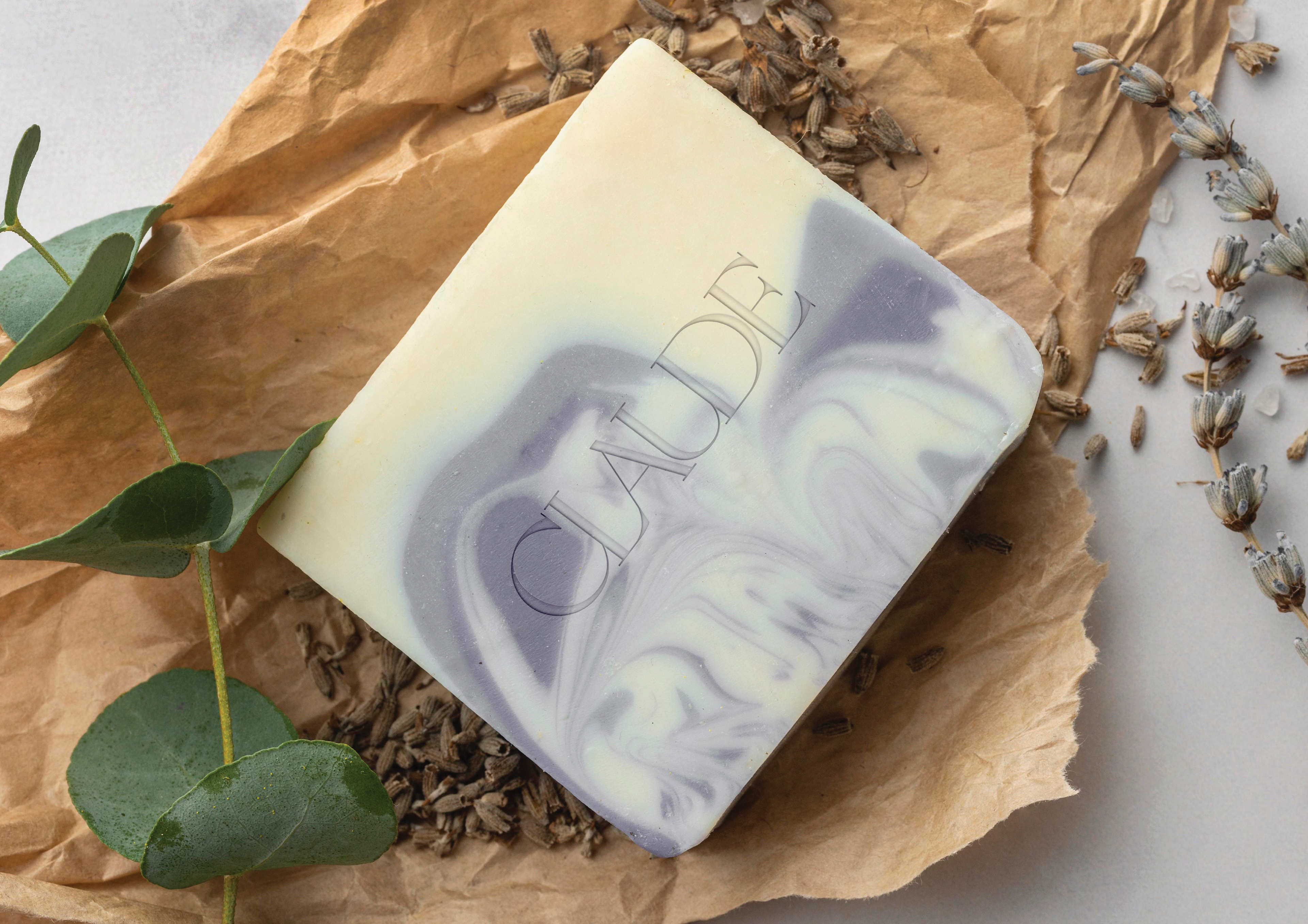
I really wanted the brand colors to further instill the feelings of calmness, so I chose mostly natural tones like beige and white. I also chose this beautiful shade of lilac, which adds a pop color without being too jarring.
After creating the branding, I wondered what walking into a CLAUDE store would feel like. Fortunately, mockups exist!