'caesura' is a fictional coffee shop/music venue. The word means "a pause marking a rhythmic point of division in a melody". Sounds like a role perfectly fit for a cup of coffee. Because even in harmonies, a break is essential.
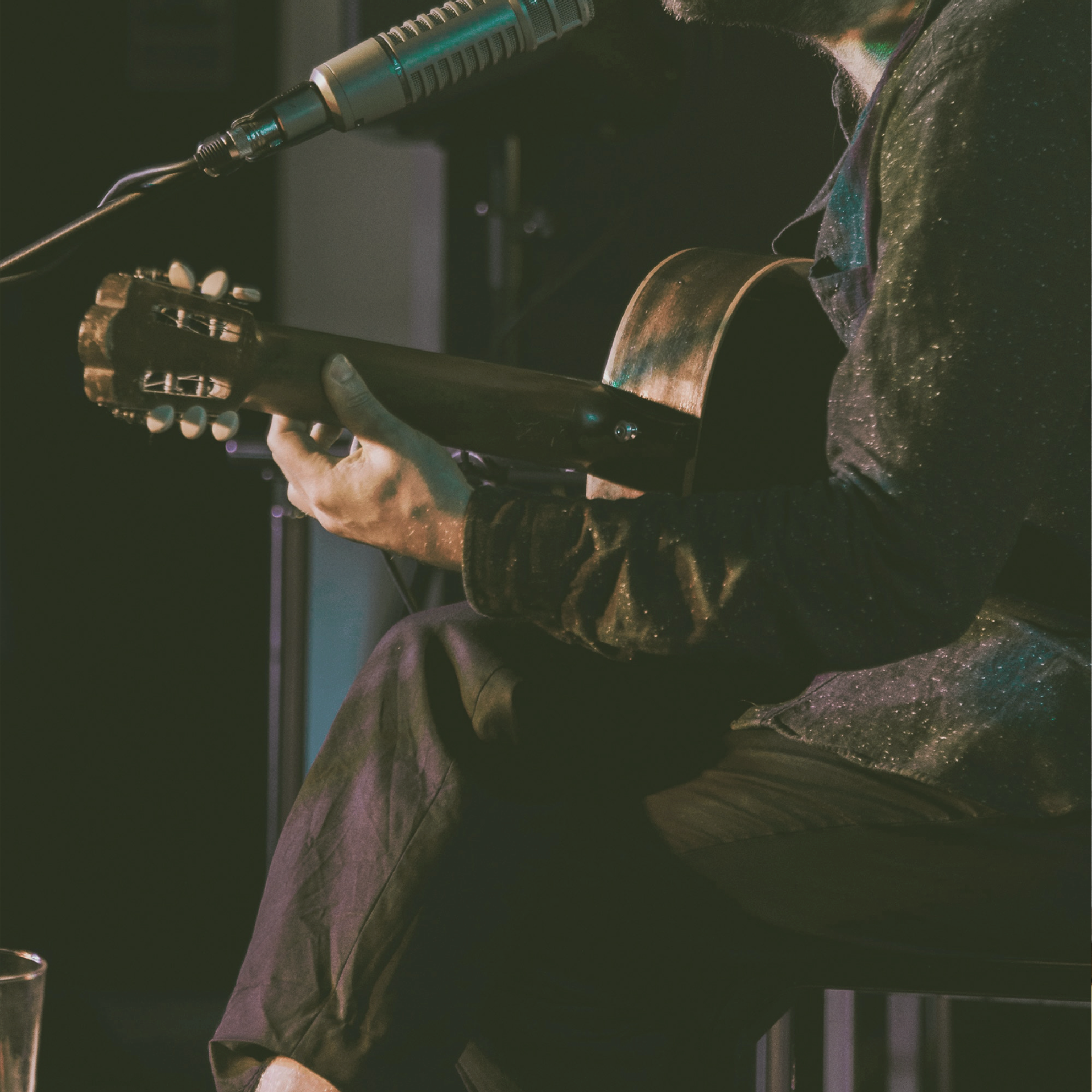
The concept for the brand draws the comparison between coffee and music, since both can be considered a balm to the soul. Coffee shop during the day, music venue during the late afternoons and nights, ‘caesura’ means to give a platform to up and coming musicians and songwriters while also being an alternative to loud smokey bars.
Branding
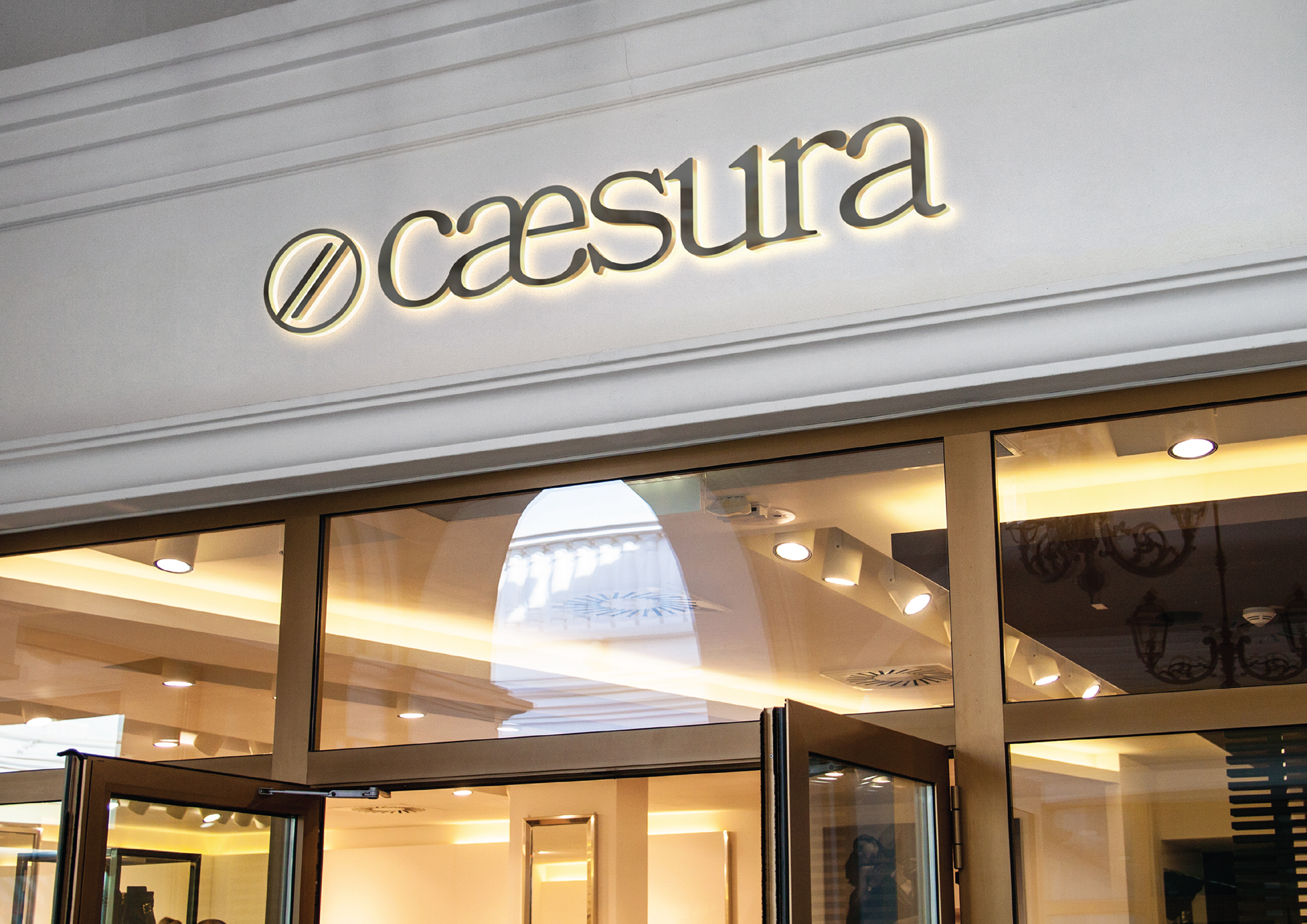
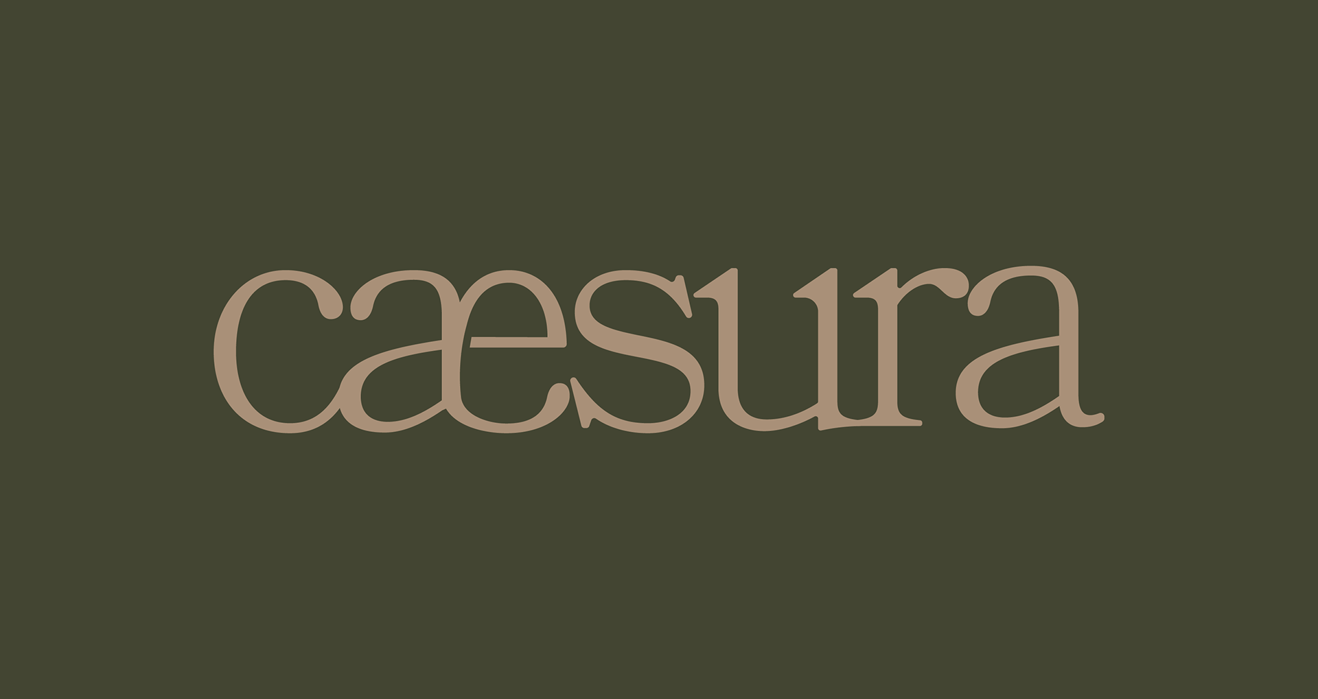
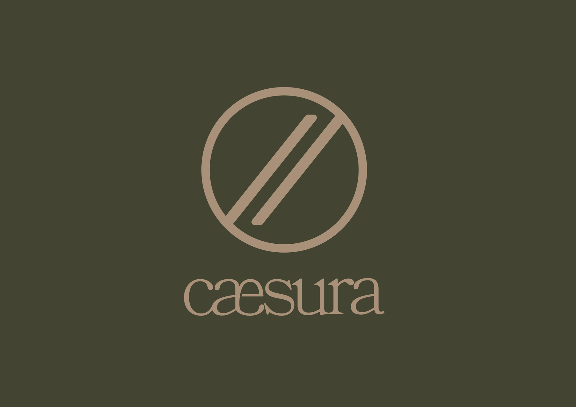
Since ‘caesura’ is a term used for both music and poetry, I wanted to give the brand a sense of lyricism, so I opted for a serif-font. I also joined up the “a” and “e”, as a nod to the word’s origin and, of course, for some personalization.
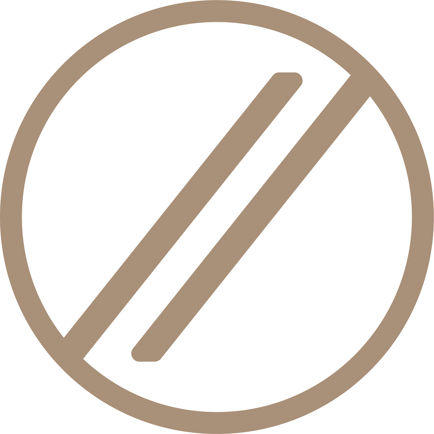
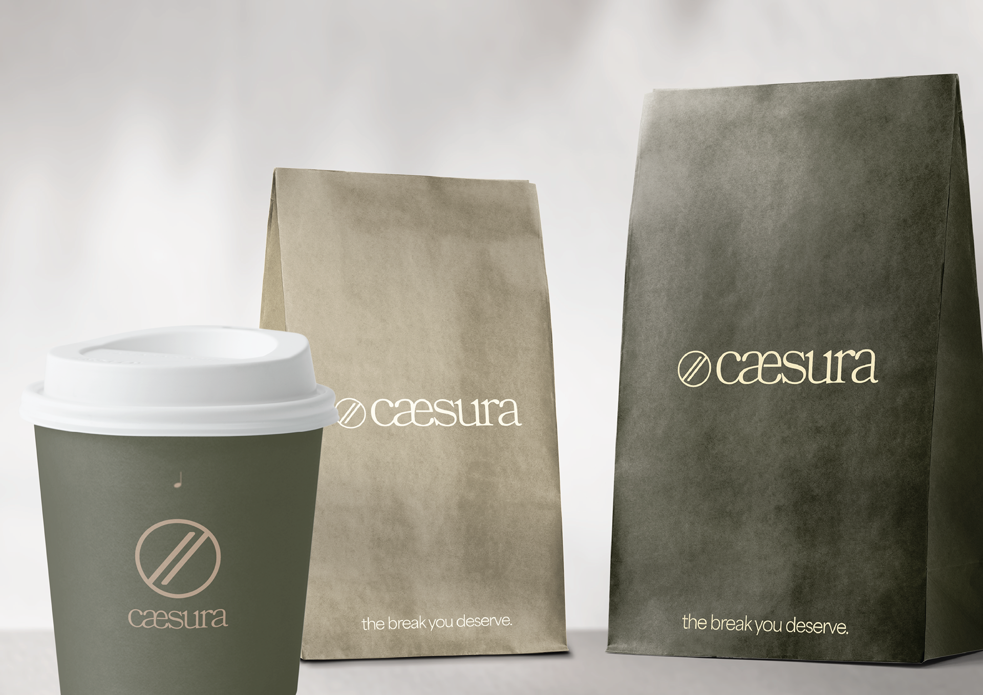
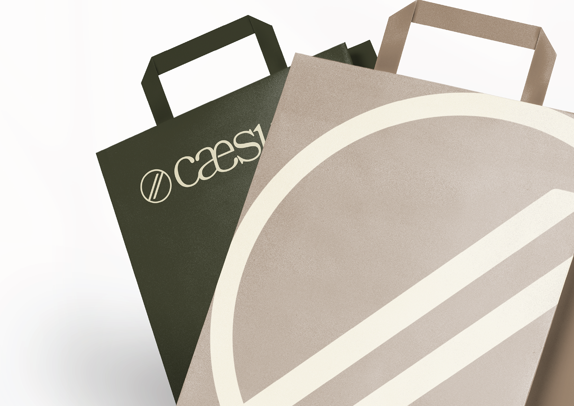
I really thought a symbol made sense for this brand. I began with two oblique lines, which are the ‘caesura’ symbol used when writing music, and placed them inside a circle. The circle reminds me of a cup of coffee seen from above. The symbol is meant to illustrate how coffee can be a break, while also making the correlation between coffee and music.
I created a few different versions of the logo, some including the tagline “the break you deserve”.
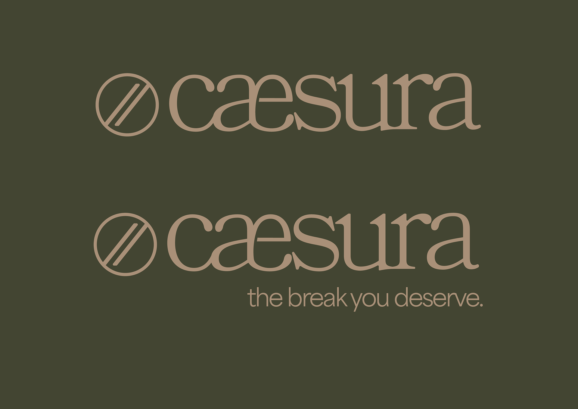
I wanted the brand colors to feel a little moody, so I opted for a dark green color and paired it with beige and off-white.